BEHIND THE COVERS OF “WHERE THEY BURN BOOKS, THEY ALSO BURN PEOPLE”


From the suburbs of Washington, D.C., Marcos Antonio Hernandez brings the historic events of lesser-known indigenous struggles to light through his captivating Hispanic American Heritage Stories collection. Haunting character portrayals and authentic settings delivered in rich detail and vivid narrative present a chilling take on humankind’s fatal flaws and the sometimes dangerous force of desire.
Inaugurated with The Education of a Wetback, the collection’s newest additions include Where They Burn Books; They Also Burn People; and Where They Burn Books, They Also Burn People. For the cover designs, Hernandez was craving a recipe that resonated with the visual style of the collection’s first installment and requested three different designs for each title. However, since Where They Burn Books, They Also Burn People is the gripping combination of the first two books, interweaving the past and present through the straight alternation of the chapters, our cover cook immediately suggested distilling two covers that interweave in the same manner as the chapters to create a new third design.
Following Hernandez’s approval of the concept, our cover cook got to work and submitted a fine-tuned first course of sample designs. Well-suited to Hernadez’s palate, the initial designs are visually very similar to the published covers, with only final seasonings added to taste.
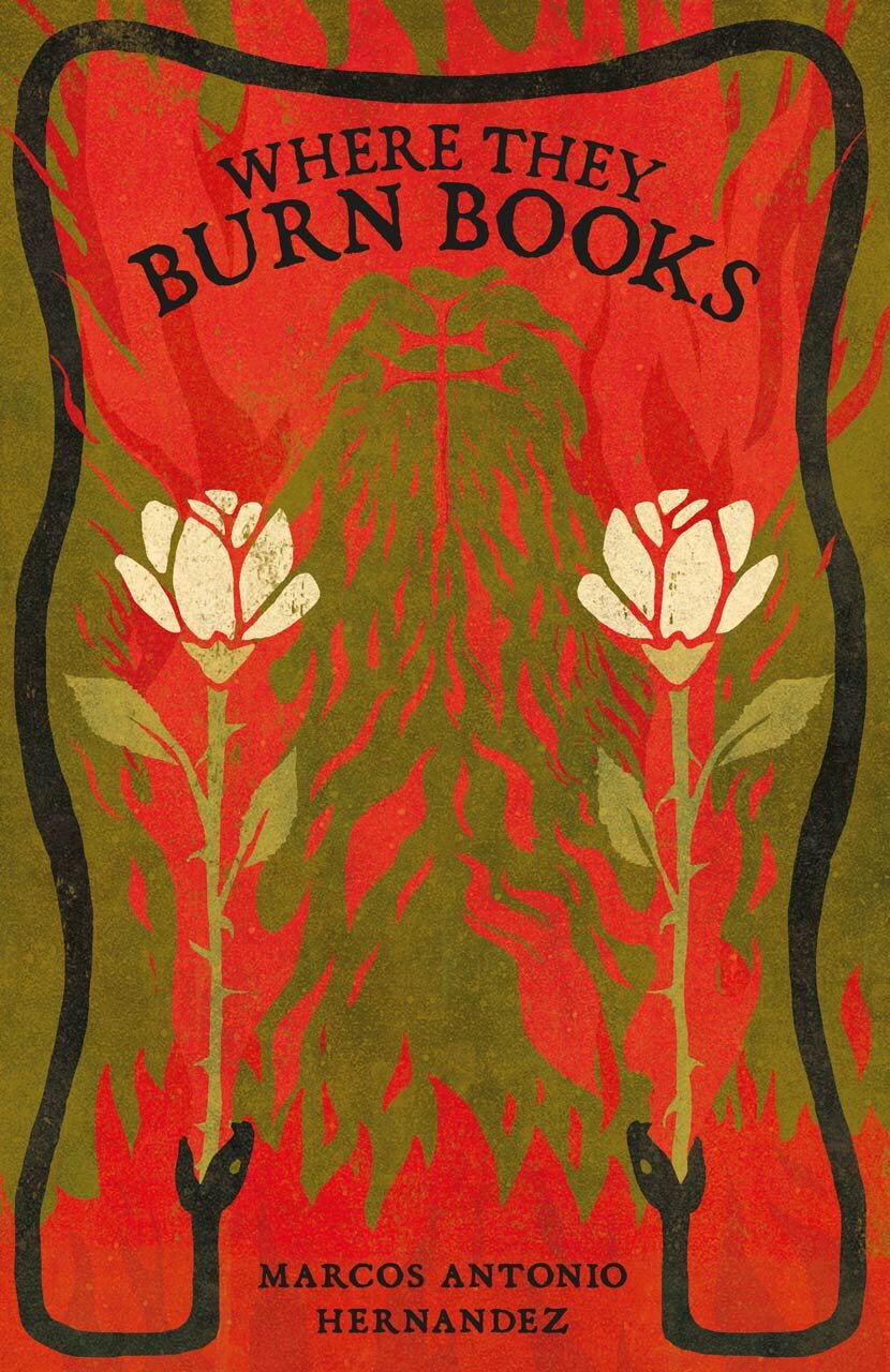
Set in 1549, Where They Burn Books narrates a fictionalized account of Diego de Landa’s Maya inquisition. Convinced God intends for him to fulfill a whispered prophecy, the young Friar Diego de Landa eagerly works to convert the Maya of the Yucatán Peninsula. Chronicling his thirteen years in the Yucatán, the novel ends with the infamous book burning event of July 1562, during which he held a public ceremony for the indigenous people and saw centuries of traditions go up in flames.
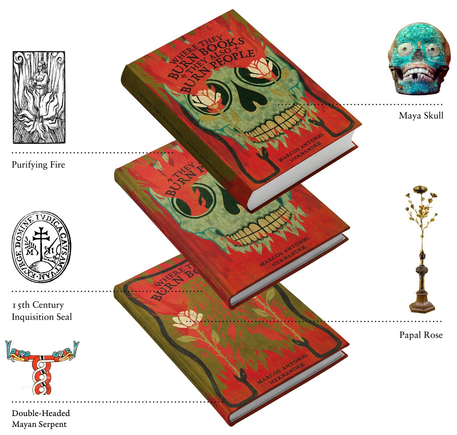
Inspired by conflicting symbols in the Christian and Maya religions, our cover cook created a flaming design that reveals the cross of La Santa Inquisición within the blaze. White roses, often associated with the purity of the Virgin, loyalty and confession in Christianity, appear among the flames too but as symbols of death, torment and martyrdom. The addition of a serpent brings a conflicting dichotomy in the form of a god for the Mayas and a devil for Christians. Connecting past and present, the serpent eating the roses presents a twist to the Ouroboros myth and hints at the death and rebirth at play in the series. The merged tails of the snakes transform them into a double-headed Vision Serpent, the direct link between the spirit realm of the gods and the physical world of the Mayas.
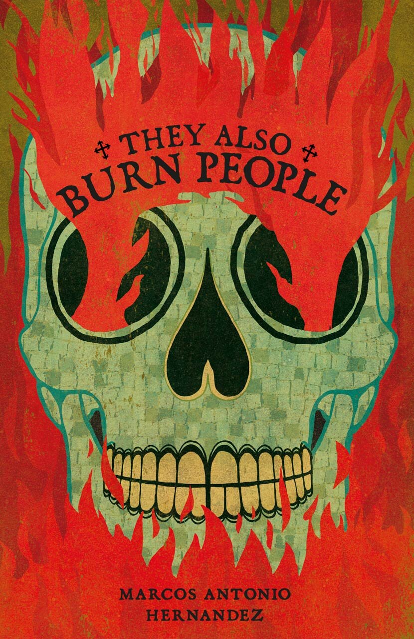
Flash-forward to an unspecified city in 2010, They Also Burn People follows Cortez Vuscar, a solitary young man and Diego de Landa’s descendant who is determined to save his struggling church. Adrift and wandering into the more affluent streets, he becomes enraptured by the beautiful Alara Chel, a descendant of the Maya. Convinced her wealthy and unfaithful boyfriend must die so they can be together, Cortez descends into a deadly madness after his fascination with the famous literature Alara is reading infects his mind.
For the second installment of the series, our cover cook used a mosaiced Mayan skull with violent flames emitting from the eye sockets to simultaneously allude to the looming death of the unfaithful boyfriend, Cortez himself, as well as the tragic history of the indigenous Maya people. The title is positioned slightly lower than the first installment, allowing for the titles of both books to perfectly interweave.
Where They Burn Books, They Also Burn People combines the first two books; alternating the chapters of each to flashback and forward between the past and the present and connect them in the process.
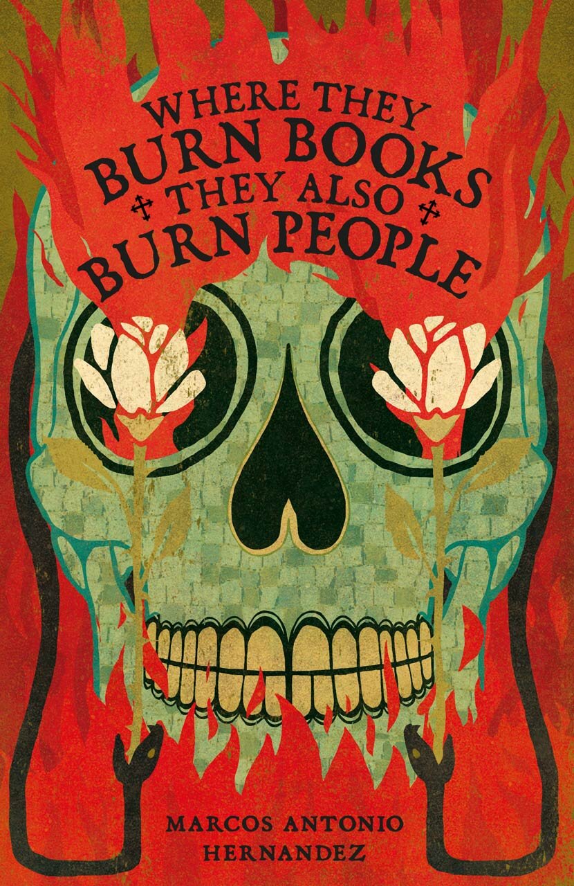
The common visual element to each of the covers is, of course, fire, exuding both tragedy and magical realism. The remaining elements featured in the first and second cover designs align perfectly to create the third. Following the combining of the two designs, the typographic composition of the titles establishes a visual hierarchy that emphasizes the words ‘Burn Books’ and ‘Burn People’; the typeface of which has a handcrafted, gritty taste that hints at the scornful, irreverent tone of voice and leaves readers intrigued to find out more
If you’re ready to release the full flavor of your book and bring it to life with a winning cover of your own, get in touch with our chef!