GUIDE: HOW TO DESIGN A COMPELLING BACK COVER FOR YOUR NEXT BOOK
When discussing book cover designs, the focus is usually on the front of the book. But while a compelling front cover will urge someone to pick your book up from the shelf, the back is what’s going to make them open it.
So how do you create a back cover that’ll grab your reader’s attention? In short, it needs to contain precise information and design elements to hook the reader, along with an attractive design. We’ve put together this guide to walk you through the process and all the little details.
Quick Reference
Why is a Back Book Cover Design Important?
5 Elements to Include on the Back Cover of Your Book
What About the Actual Design Elements?
Consider Working With a Professional Book Cover Designer
Why is a Back Book Cover Design Important?
A well-made back cover design contains just enough information to get a potential customer’s attention and pique their interest – such as an author bio and a captivating blurb that makes them want to read more.
While the wording plays a critical part, don’t underestimate how important clever design is. Your cover design should be clean and the fonts easy to read. The font style, size, and text placement (typesetting) should separate different content parts to set a hierarchy and guide readers through the information.
5 Elements to Include on the Back Cover of Your Book

An Aesthetic That Matches the Rest of the Book
The back cover doesn’t necessarily have to match the front cover exactly, but it should feel like the same book – with everything from typeface to color scheme. If your front cover was intriguing enough for someone to pick up, the goal is to keep that interest going when they scan through the back cover.
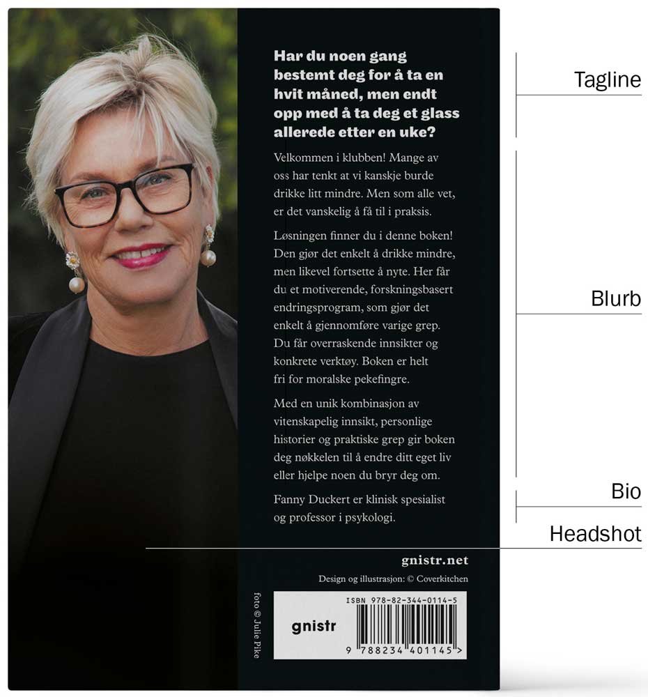
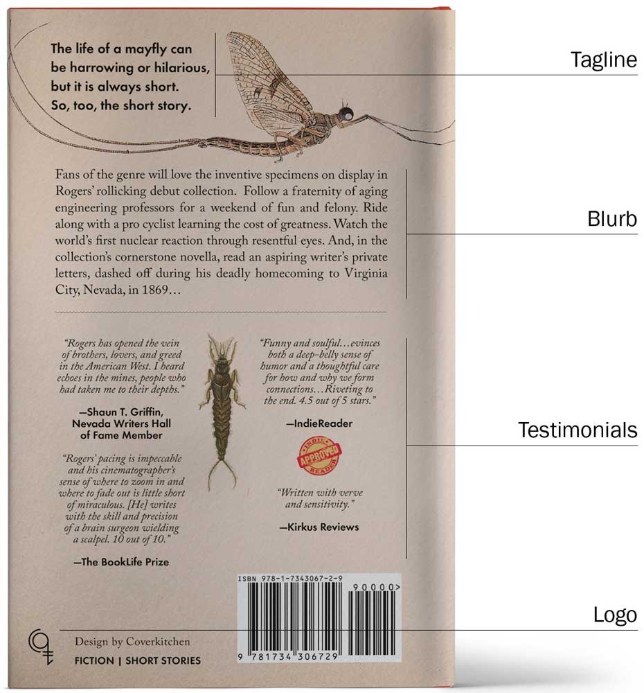
A Compelling Tagline
When a potential customer is interested enough to grab your book and read the back of it, they’re usually looking for confirmation that it’s the right one for them. The best way to keep them intrigued is to have a compelling, easy-to-read tagline. Make sure to place it close to the top so readers can scan the cover without missing it.
Your tagline can be a short, descriptive sentence or phrase. You might want to use a quote from your book or a review. Although the tagline may seem simple, it’s far from it. It’s your first opportunity to convince potential readers to make the purchase, so don’t rush this part of the process.
A Succinct Blurb
The tagline is typically the first thing a potential customer looks at, but the blurb is where they get to know what your book is all about – and decide whether or not to buy it. A blurb should not be mistaken for a lengthy synopsis of your book. Trying to cram too much text onto the back cover will only make people quickly lose interest. Your blurb is like an elevator pitch – an opportunity to convey your story in 30 seconds or less.
The best strategy is to tease the reader with content without giving away any spoilers. Ideally, it’ll bring out the theme, style, and subject matter in a short and compelling description.
It’s just as important to remember who you’re writing for. Who is your target audience, and what will interest them the most? Here are two basic outlines for fiction and non-fiction blurbs:
Fiction
Keep the blurb short, punchy, and intriguing.
Hint at the emotions they can expect from reading your book. A great novel is as much an emotional journey as anything else.
Convey your writing style in the blurb so readers know what to expect.
Nonfiction
Identify the questions, challenges, or problems you’re exploring in the book.
Make it clear that it provides the answers they’re looking for.
Explain what they'll get from reading your book.
Your Author Bio
Writing a description of yourself can be tricky. Since potential readers scan the back to learn more about your book, it’s not the place for a lengthy description of yourself. The thing to remember is to keep your author bio brief and relevant.
Here’s an example of an author bio that ticks all the boxes – it’s short, engaging, informative, and packed with personality:
Michael Siemsen is the USA Today Bestselling author of 6 novels, including The Dig, A Warm Place to Call Home (A Demon’s Story), and Exigency. He lives in Northern California with “the wife,” “the kids,” “the dogs,” “that cat,” and he occasionally wears pants. His upcoming release, Frederick & Samuel, is the third book in his award-winning A Demon’s Story series.
If you’re a fiction writer, you can even get away with skipping the author bio. But for nonfiction writers, your bio is an opportunity to establish your authority on the subject.
Testimonials
Testimonials or quotes from reviews are a fantastic way to add credibility and authority. Using social proof is a well-established marketing strategy because people want what people want. Snippets from positive reviews can be the deciding factor for whether or not someone buys your book – that’s how huge their impact is. There’s no set rule for how many of them to include, but aiming for no more than three is usually good.
From a marketing perspective, it’s best to use reviews from influential people like other authors, people in the industry, or known publications. If you have testimonials from a reputable source, make sure to include their credentials. Keep in mind that using testimonials on your cover means you’ll need to do a pre-release of your book.
The Boring Elements
The back cover isn’t all about design and catchy content. Every book must have an ISBN (International Standard Book Number) and a barcode. Remember that you also need to include space for the price tag. It’s a good idea to check with your printer or publisher since some have specific requirements for the back book cover, e.g., the placement of your ISBN barcode and the correct color profile and settings for your digital file.
What About the Actual Design Elements?
When it comes to the design elements, here are some pointers to keep in mind:
Put the reader at the forefront of every decision. That means you should never choose a typeface or color scheme that will sacrifice readability, even if it looks good.
Since readers scan the back cover to find relevant information, make sure you organize your layout, so it’s accessible and easy to read. For example, don’t bury your tagline at the bottom or fill the top ⅓ of your cover with author information.
Don’t overcrowd your back cover – less is often more. A cluttered cover can be overwhelming enough that potential buyers don’t bother reading the back.
Your back cover design should build an atmosphere and set the tone just like the front. You want potential readers to get a sense of what your book is about before they start reading.
Here are a few example back covers we’ve created where you can see this in action!
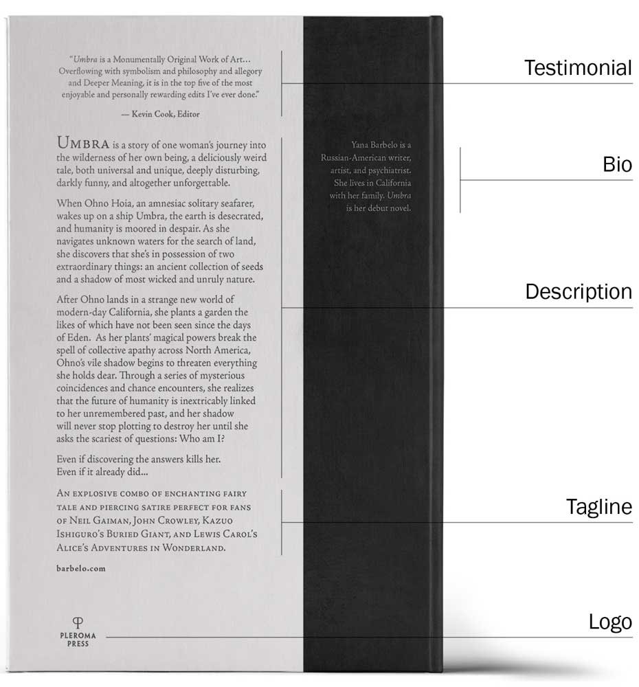
Consider Working With a Professional Book Cover Designer
After putting countless hours into writing and editing, you’ll want to make sure the back cover of your book turns out how you’ve envisioned it. If you lack design experience, hiring a professional book designer can be a worthwhile investment that brings you tangible results.
They can add value to your back cover beyond the obvious design experience. For example, the cover design may carry over onto the spine and the back cover. This means that the cover spread (cover, spine and back cover) could be designed as a whole from the start, depending on the concept.
Also, outsourcing this step frees you to focus on other vital parts of the publishing process like marketing.
10 Back Book Cover Design Examples from Cover Kitchen
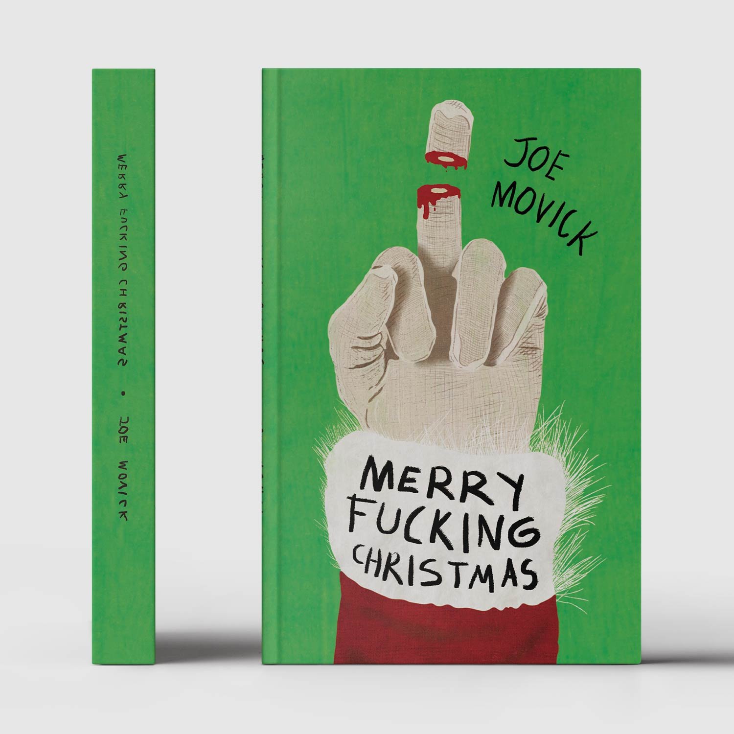
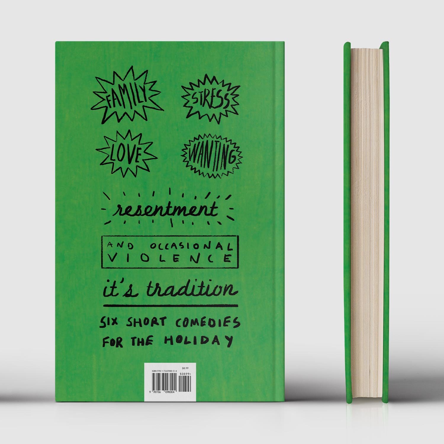
Merry Fucking Christmas is a collection of dark humor short stories moving chronologically through the holiday period. The blatant front cover design carries on the back cover, where a mismatch of handwritten fonts and Christmas sales-inspired tags echo the irreverent tone from the book.
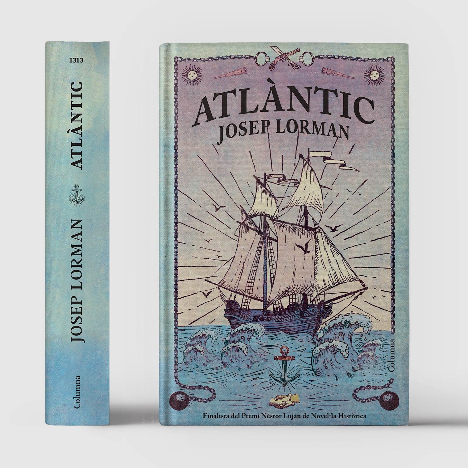
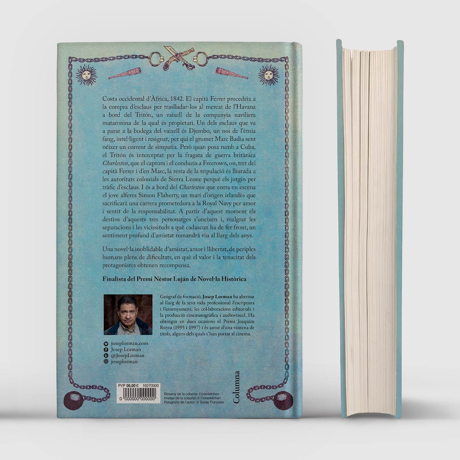
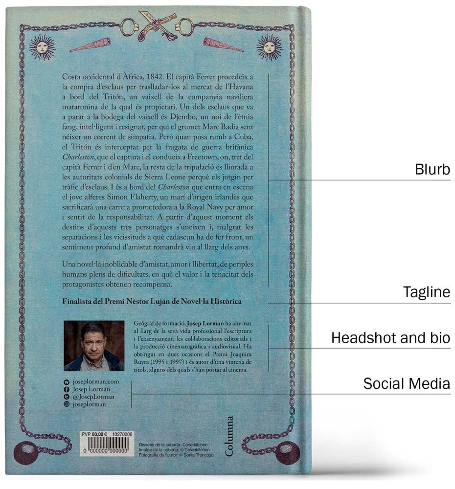
Atlàntic is a mid-19th century epic tale of the slave trade at sea. Slave chains provide an unexpected decorative frame to the back cover blurb and the award-winning author’s bio, headshot, and social media links.
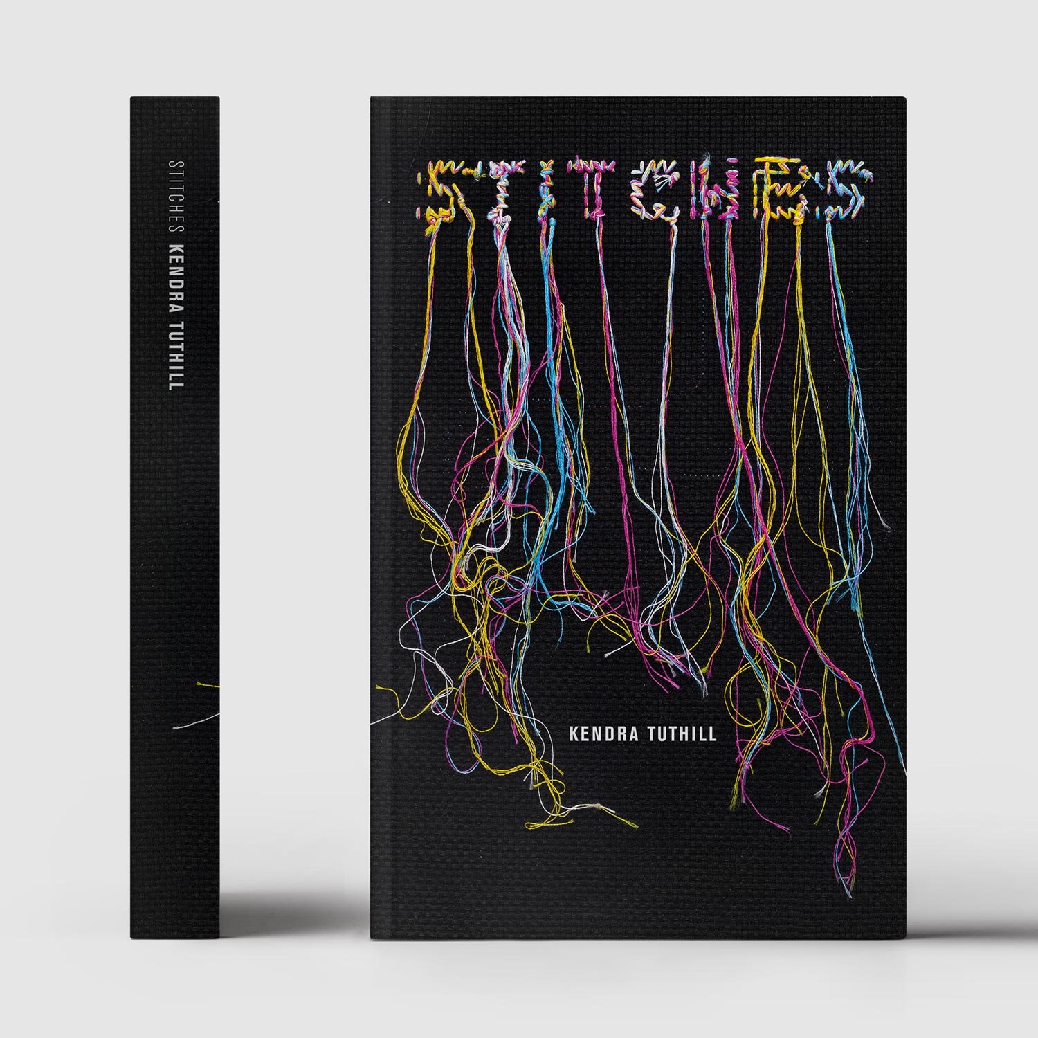
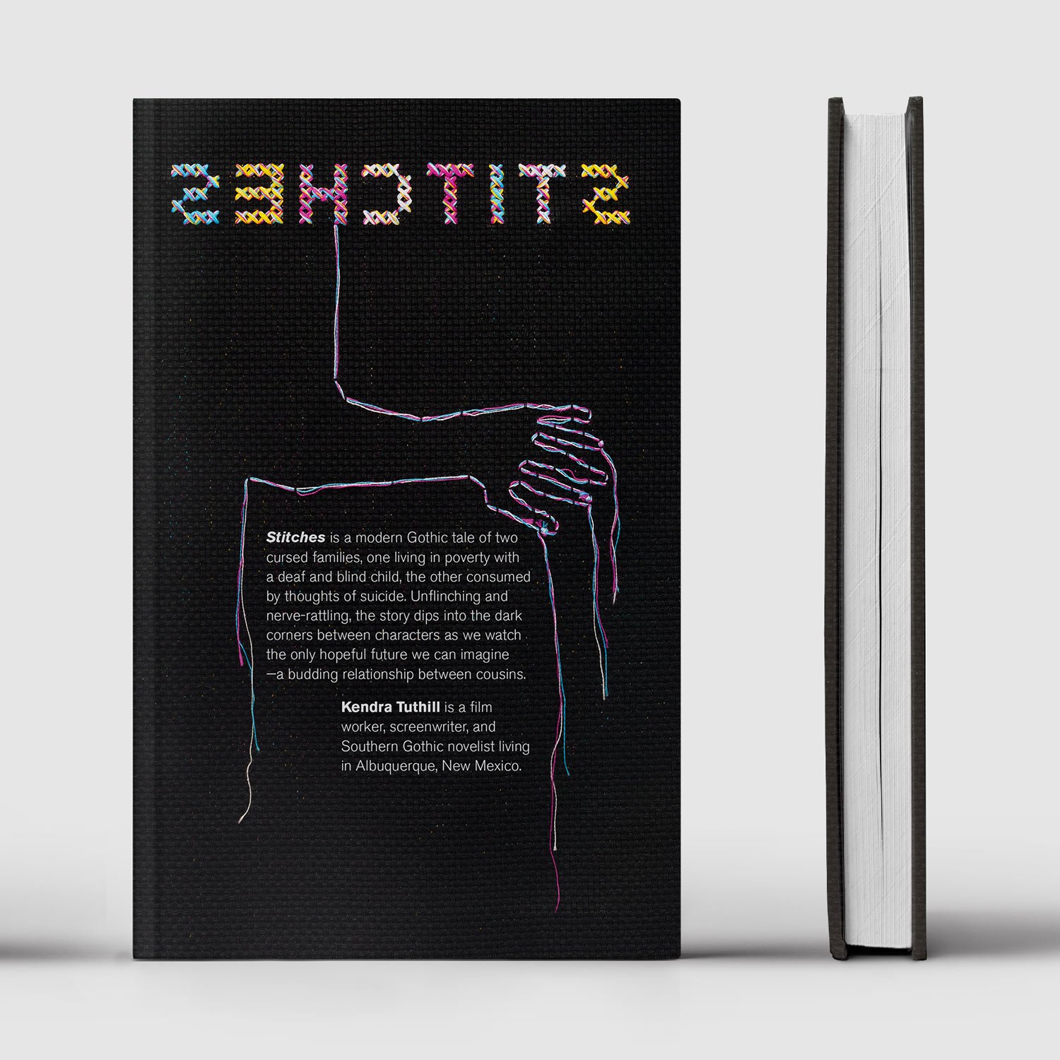
Stitches is a Southern Gothic novel about a haunted Baltimore family desperately trying to pull their lives together. The design twists the idea of what is the front and the back. The messy back of the cross-stitched title is featured on the front of the cover, while the back cover reveals the front side of the stitch with the title reversed, threaded to a disturbing secret from the story.
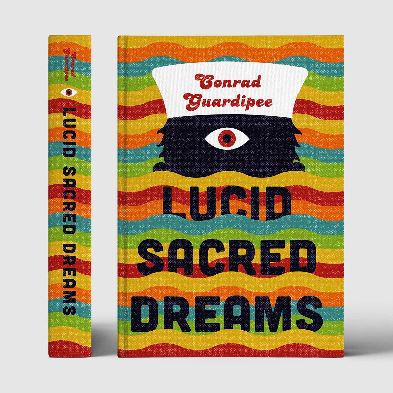
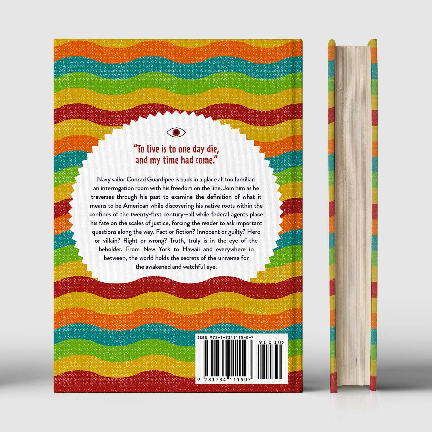
Lucid Sacred Dreams is a debut novel of modern adventure and the spiritual awakening of a navy sailor. The different layers of reality undulate with color across the cover spread. The back cover blurb floats amidst the waves.
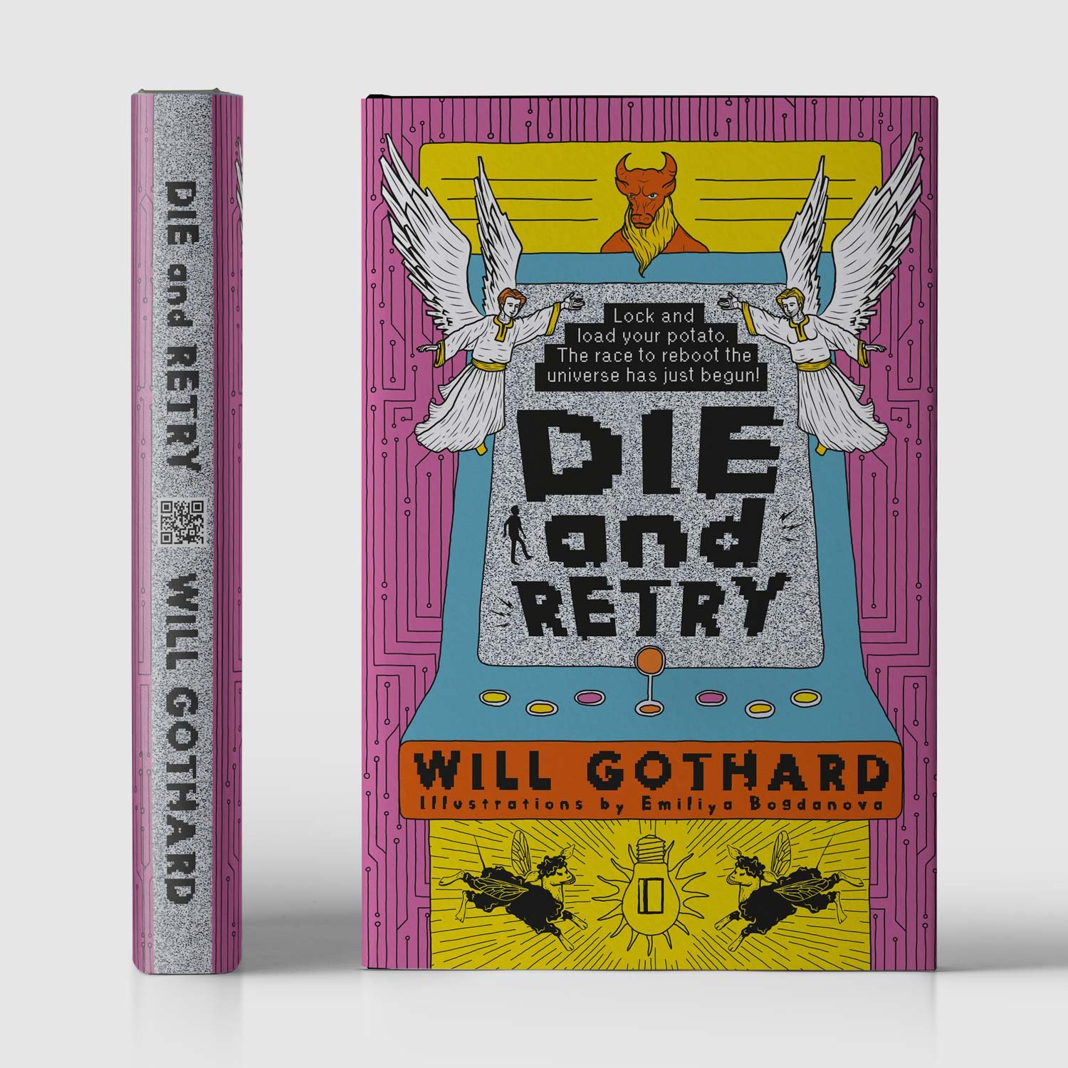
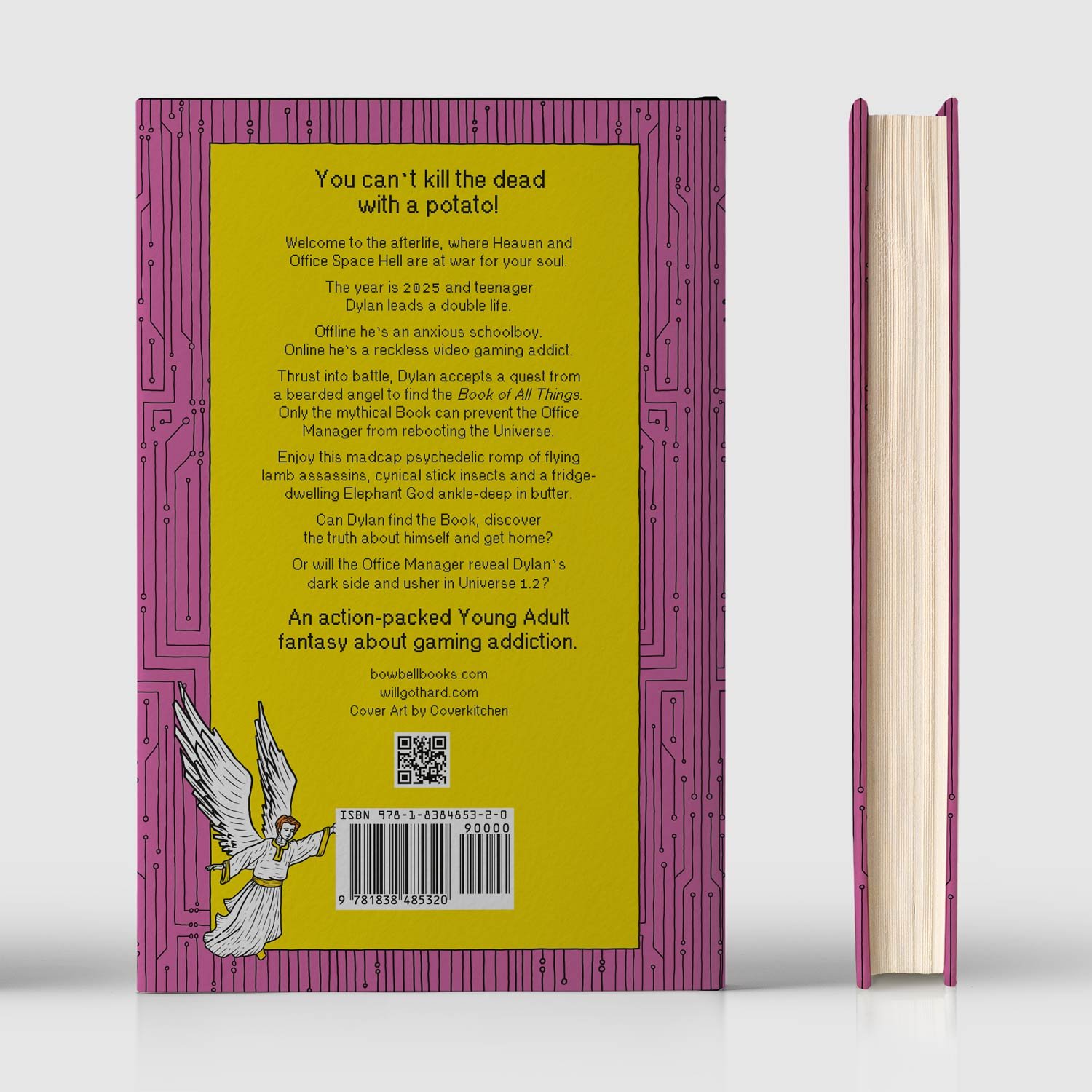
Die and Retry is a high-fantasy story about gaming addiction for Young Adults filled with mythical characters. The circuitry background carries on the back cover, where the illustration of the angel announces the blurb.
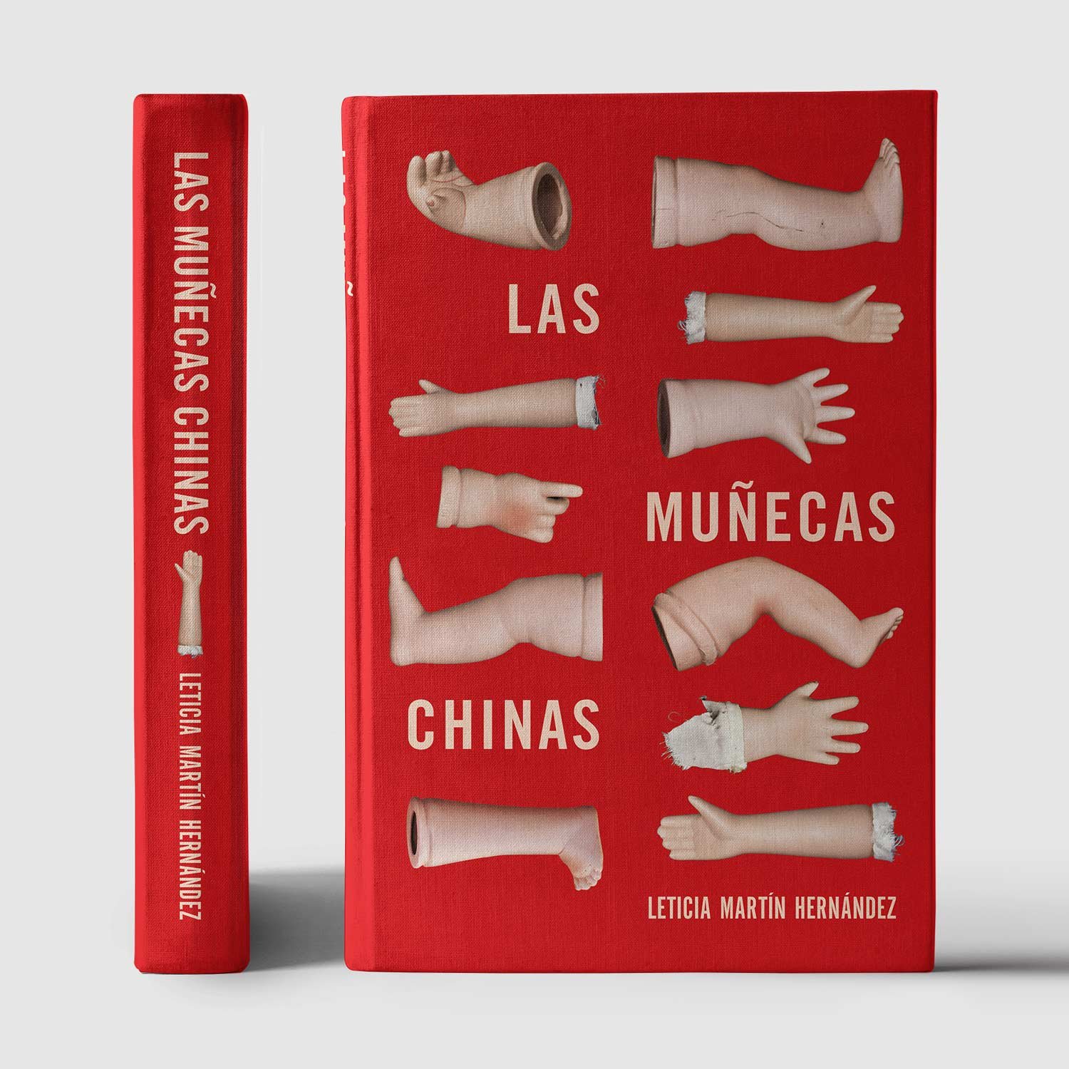
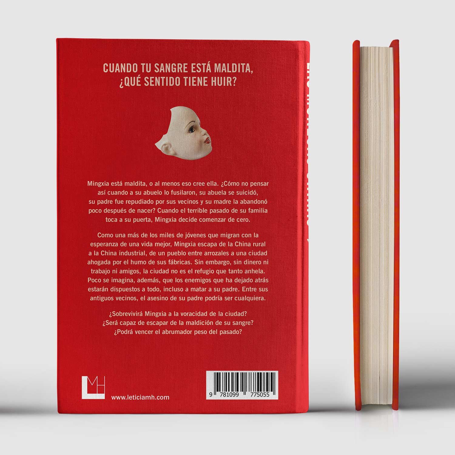
Las muñecas chinas (The Chinese Dolls)is a coming-of-age novel set in contemporary China with elements of a psychological thriller and magical realism. The doll’s head appears on the back cover as the missing piece from the cover puzzle. In addition to being informative, the back cover unveils a clue from the past that haunts the protagonist.
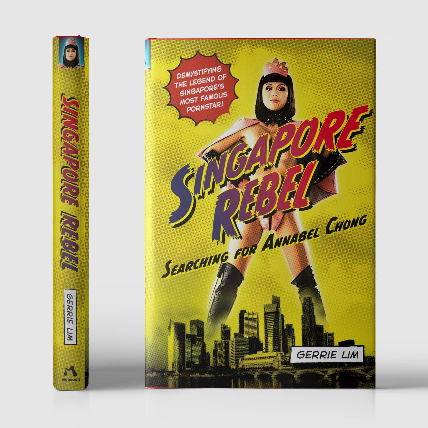
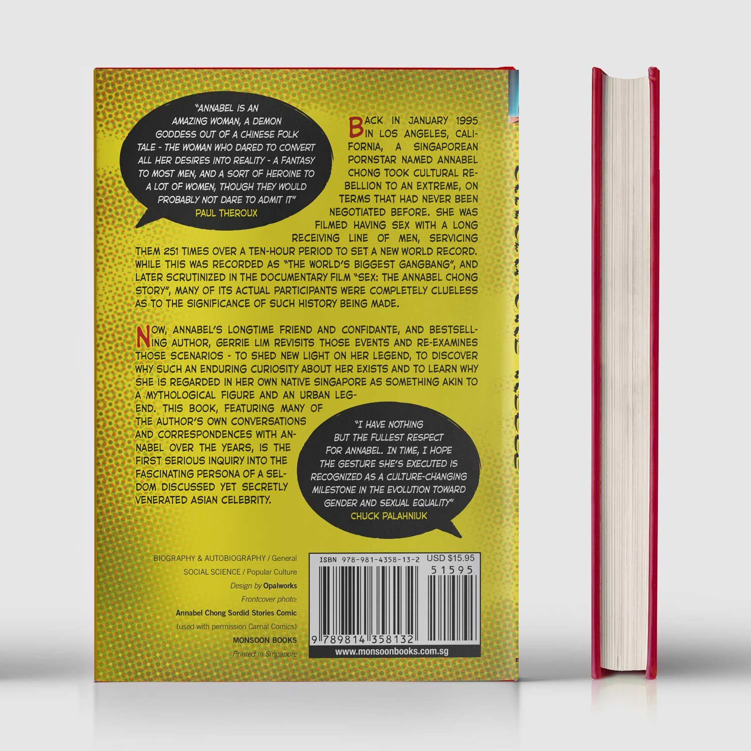
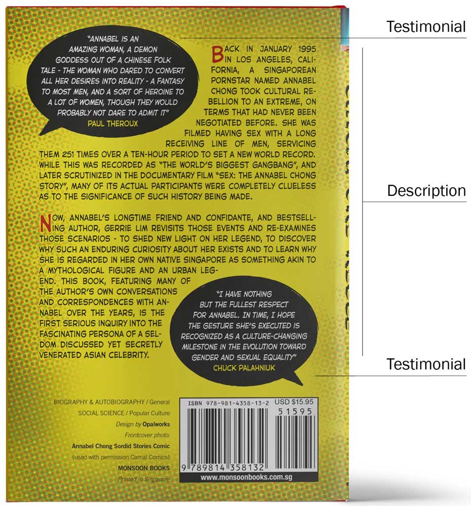
Singapore Rebel is the memoir of a Singaporean pornstar. The back book cover design carries on the comic-book aesthetic from the front cover, integrating the testimonials as the speech balloons so ubiquitous in graphic novels.
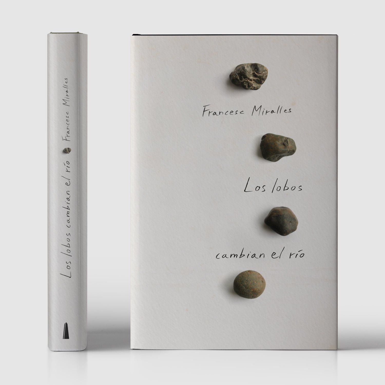
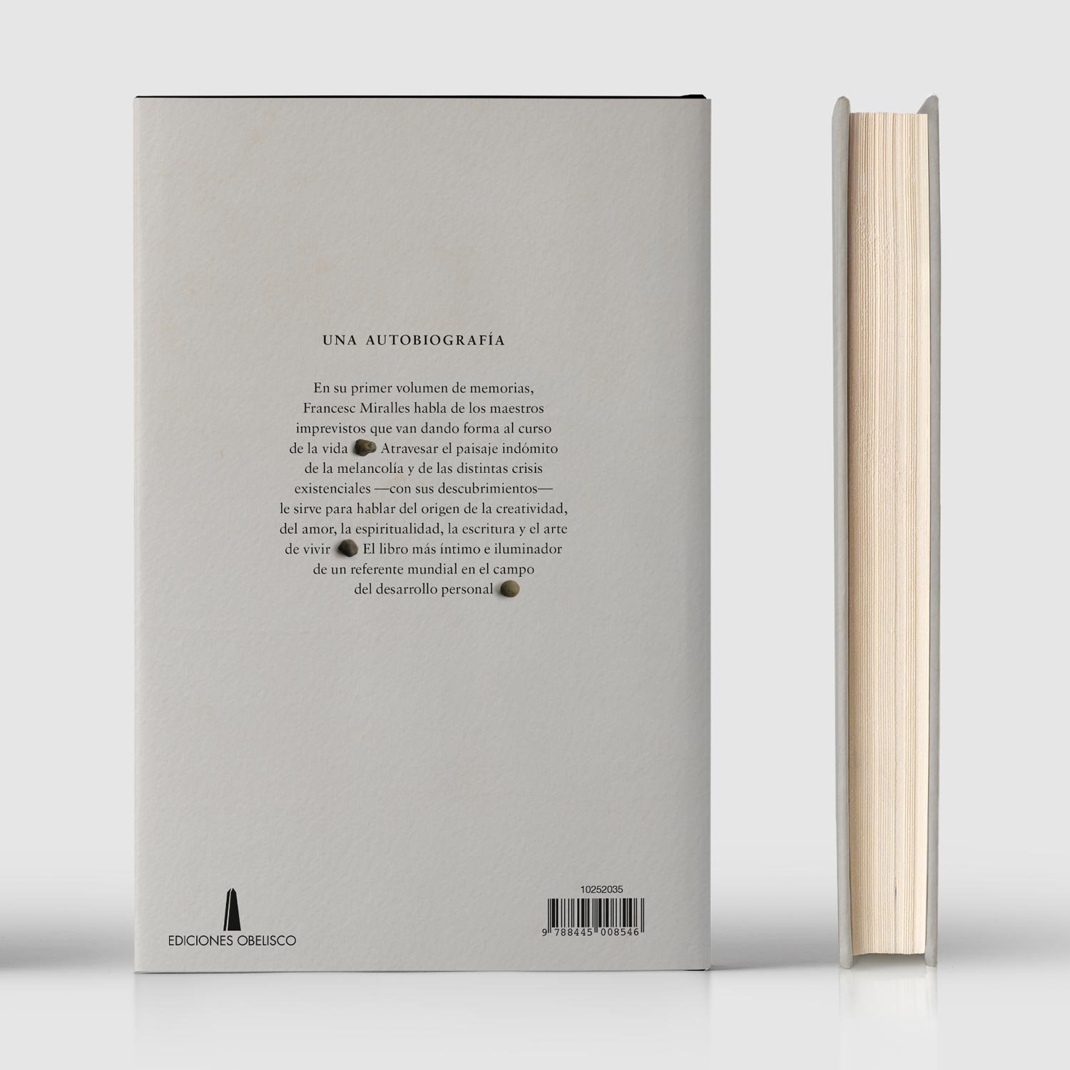
Los Lobos Cambian El Río (The Wolves Change the River) is a memoir by international best-selling author Francesc Miralles. The river pebbles, polished in gradual steps to symbolize the stages of life development, replace punctuation between clauses on the back cover.
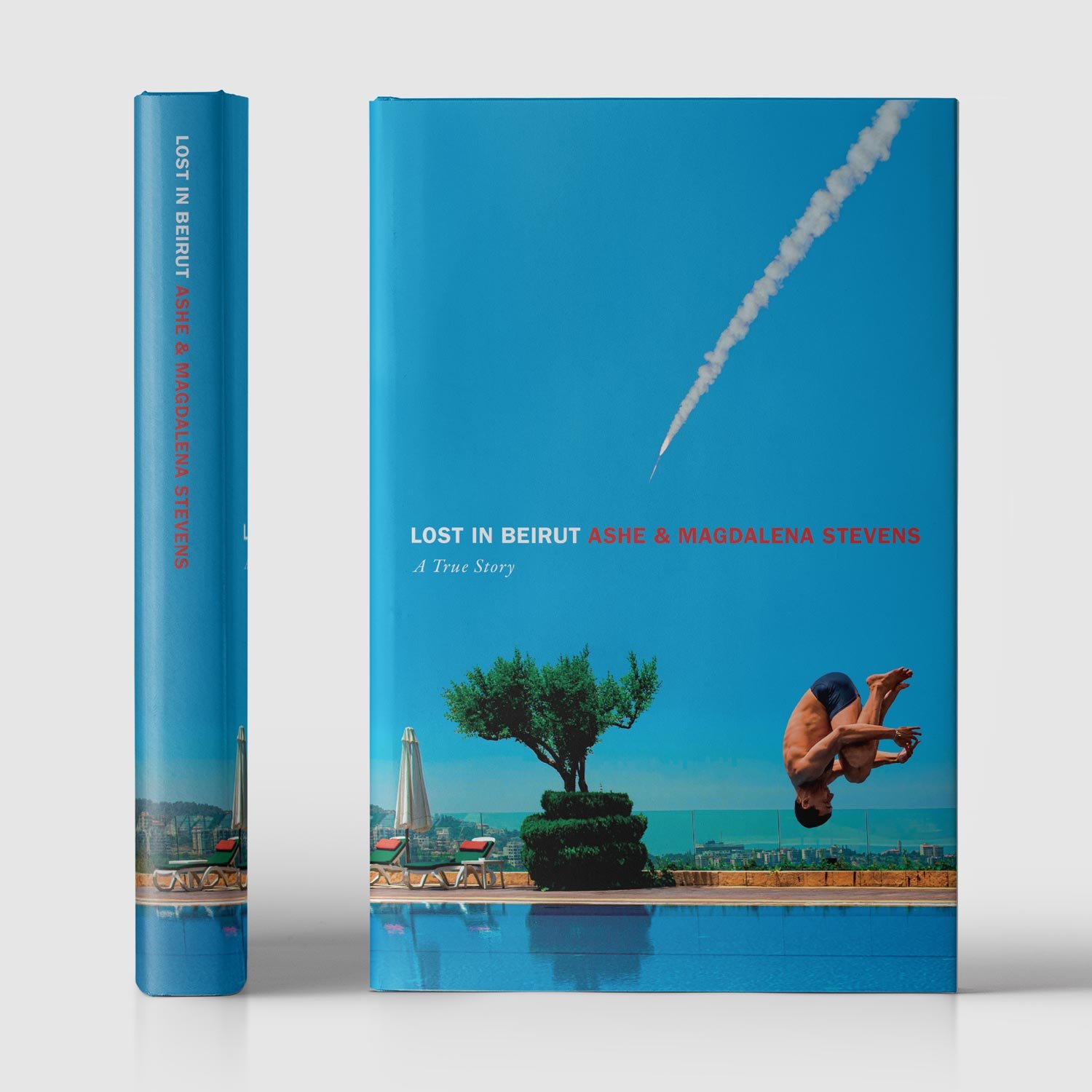
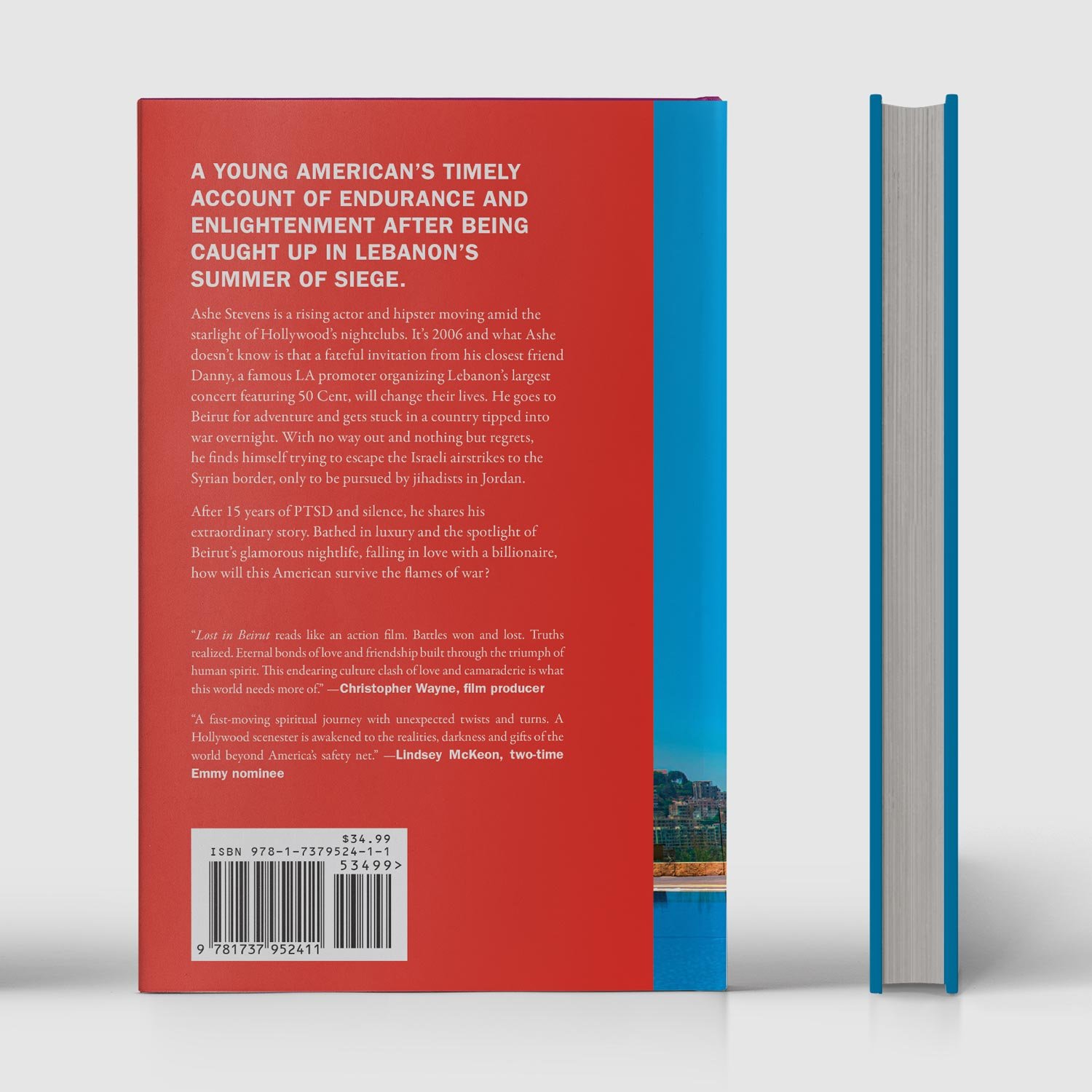
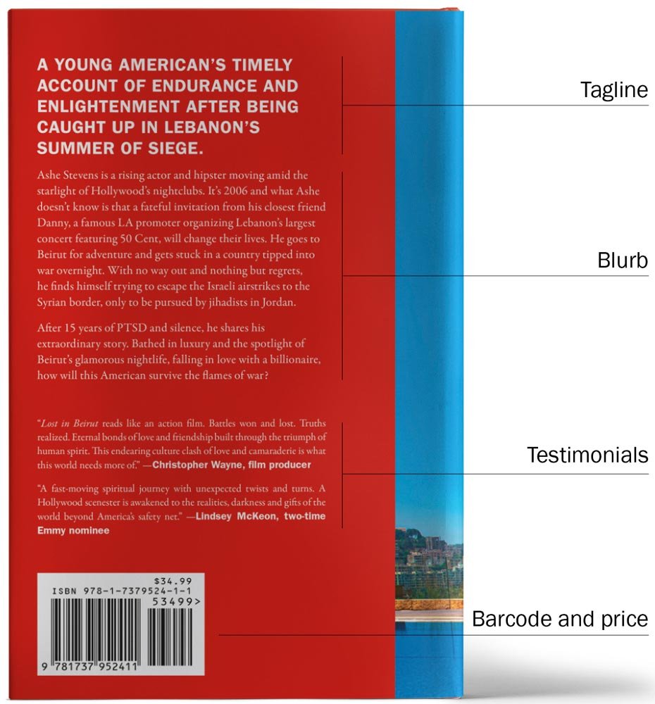
Lost in Beirut is the true story of a rising Hollywood actor who traveled to Lebanon in 2006 to find himself bathing in luxury to plunge into war. The back cover is an example of how typesetting sets a clear hierarchy with a prominent tagline set in the upper case at the top—bright red paints the entire back cover to warn of impending danger from the cover.
Frequently asked questions
Finally, let’s take a look at the most frequently asked questions about book back cover design. If you have more questions about how to design one for your book or the process for us to do it for you, we’d love to hear from you!
Just send us an email and we’ll get back to you in no time.
Where do I place the price on the back cover of a book?
You generally put the price either on the bottom left or the bottom right of your back cover. It’s a good idea to check with your printer or publisher if they have specific requirements around this.
Can we use a different font on the back cover than in the book interior?
You can use a different font if it’s in tune with your book’s overall theme and aesthetic. For example, if you’ve written a futuristic sci-fi book, an old-fashioned font will give the wrong impression. The most important thing to remember is that the font, size, and color should be easy to read.
How long does it take to design a back book cover?
In our experience, the design process for the back cover of a book takes around a week. In some instances, that can be prolonged if there are external delays from the author’s end.